Decoding the Indian IPO Market

Every IPO cycle in India comes with the same familiar excitement. A company opens for subscription, WhatsApp groups start discussing GMP, retail investors rush to apply through every Demat account available, and the biggest question becomes: will this list at a premium?
This project began with that very practical question, but I wanted to answer it with data rather than anecdotes:
Is investing in Indian IPOs actually profitable, and which pre-listing signals best predict IPO success?
The result is a quantitative study of Indian IPOs across mainboard, SME, and GMP-era datasets, covering listing-day gains, oversubscription, grey market premium, market phase, holding periods, long-run performance, and machine learning based screening. The analysis uses web-scraped IPO data, API-collected GMP data, Yahoo Finance enrichment, and statistical tests designed for heavily skewed financial data.
This blog is a detailed walkthrough of the project report and notebook. I will not just state the results; I will explain what each number means, why each test was used, and what a retail investor or data science reader can learn from the patterns.
The Core Question
IPO investing sounds simple:
- Apply for shares during the subscription window.
- Hope to get allotted.
- Sell on listing day if the stock lists at a premium.
- Repeat for the next IPO.
This is the standard “listing gain” strategy. It is especially popular in India because IPOs often open above their issue price, and because the application process is now frictionless through UPI and broker apps.
But the strategy hides several hard questions:
- Are listing gains positive on average?
- Is the average return representative of what a typical investor experiences?
- Can oversubscription or GMP identify better IPOs?
- Should investors sell on listing day or hold for months and years?
- Are SME IPOs really better than mainboard IPOs?
- Can a machine learning model improve IPO selection?
The project answers these using multiple datasets and a hierarchy of strategies, from a naive all-IPO baseline to a trained classifier.
Before moving further, one caution: this is research, not financial advice. IPO investing involves allocation uncertainty, taxation, brokerage, liquidity risk, and market risk. The results below measure historical behaviour; they do not guarantee future outcomes.
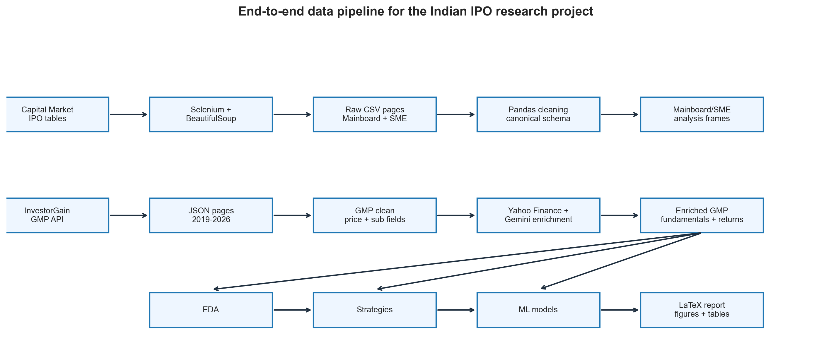
Data Construction: Why This Was Half the Project
The most time-consuming part of the project was not modelling. It was building the data.
There is no single clean public dataset that contains Indian IPO listing gains, subscription breakdowns, GMP, company fundamentals, market regime variables, and long-horizon returns. So I constructed and enriched the datasets from multiple sources.
The analysis uses three main data layers:
| Dataset | Coverage | Role in the project |
|---|---|---|
| Mainboard IPO dataset | 1999-2026 | Long-history listing gain and subscription analysis |
| SME IPO dataset | 2012-2026 | SME vs mainboard comparison and liquidity patterns |
| GMP enriched dataset | 2019-2026 | GMP, holding period, ML modelling, backtesting |
The exact sample size changes by analysis because each test requires different fields. For example, the all-IPO mainboard baseline uses 1,177 IPOs with listing gain data, while subscription-filter analysis uses 788 IPOs with subscription data. The GMP modelling dataset uses 1,075 IPOs with valid listing gains and GMP fields.
That distinction matters. In empirical finance, there is rarely one universal N. The honest question is always: how many observations have the fields needed for this specific test?
Scraping the Mainboard IPO Dataset
The primary source for the historical mainboard IPO table was Capital Market. The challenge was that the table uses stateful, JavaScript-driven pagination. The URL does not simply change from page=1 to page=2; instead, the page changes inside the browser.
A normal requests.get() scraper would fail because it would only see the first state of the page. The solution was Selenium with ChromeDriver, which controls a real browser session.
The scraper followed this logic:
| |
The most important engineering detail was the wait condition. After clicking a pagination button, the scraper did not blindly sleep for a fixed time. It computed a table signature and waited until that signature changed. This made the scrape more robust against slow page loads.
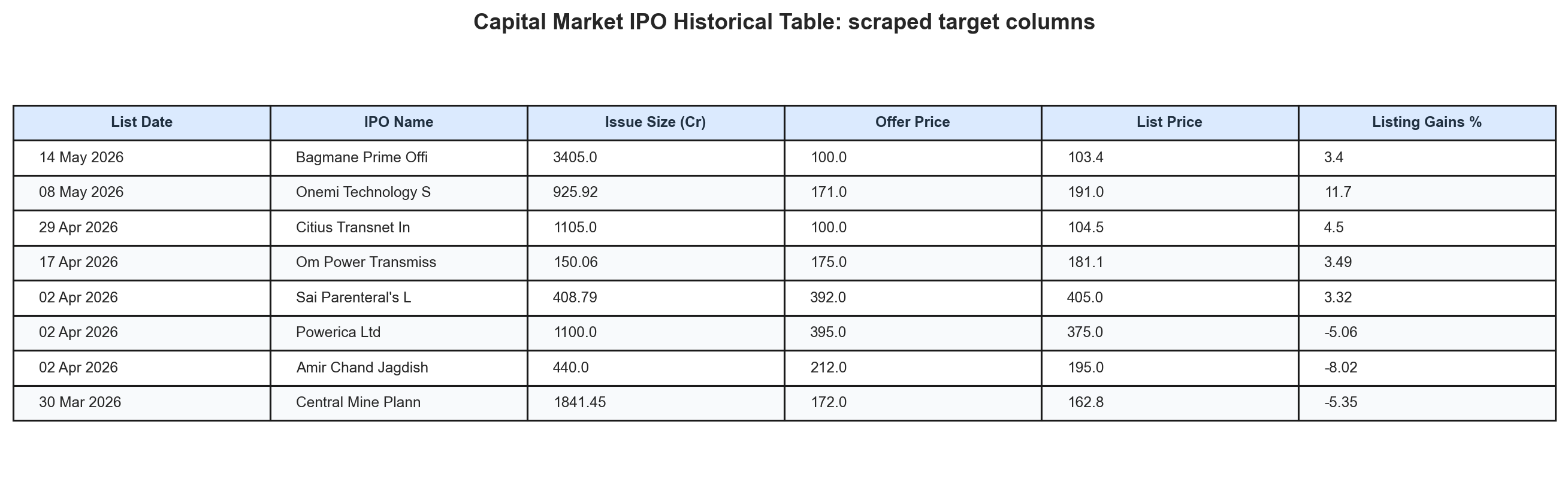
The scraped fields included listing date, IPO name, offer price, listing price, listing gain, issue size, and subscription fields wherever available. Older IPOs often had weaker subscription breakdown coverage, which is why the subscription analysis uses a smaller sample than the listing-gain baseline.
Collecting GMP Data
The Grey Market Premium, or GMP, is one of the most watched IPO signals in India. It measures the informal premium at which IPO shares trade before official listing.
For example, if an IPO has an issue price of Rs. 200 and its grey market premium is Rs. 40, then:
$$ \text{GMP%} = \frac{40}{200} \times 100 = 20% $$
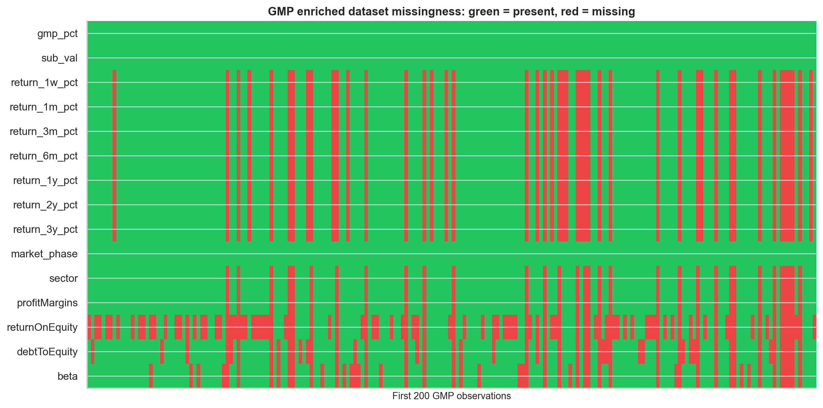
The project collected GMP data from the InvestorGain API for 2019-2026. The raw API returned paginated JSON, with GMP values stored as text strings containing rupee symbols, percentages, missing values, and HTML artifacts. Those fields had to be parsed and normalised.
The final GMP enriched dataset contains 1,075 IPOs with valid listing gain data. It is especially valuable because it includes:
- GMP as a percentage of offer price
- Subscription multiple
- Mainboard vs SME flag
- Listing gain
- Post-listing returns at 1 week, 1 month, 3 months, 6 months, 1 year, 2 years, and 3 years
- Yahoo Finance enrichment where available
- Market regime features based on Nifty returns
Enrichment With Yahoo Finance and Market Variables
The raw IPO tables alone are not enough. To understand why some IPOs perform better, I added additional features:
- Profit after tax, profit margin, ROE, revenue growth, debt-to-equity
- Trailing P/E and price-to-book where available
- Post-listing returns across multiple horizons
- Nifty 50 returns before listing
- Market phase labels: bull, sideways, bear
- Rolling 30-day and 90-day IPO market momentum
- Recent IPO count, used as a proxy for pipeline congestion
Ticker matching was a real data engineering problem. IPO names do not always map cleanly to Yahoo Finance ticker symbols because of abbreviations, renamings, mergers, and exchange suffixes. I used Gemini AI as a ticker-resolution assistant, then passed the resolved tickers to yahooquery for enrichment.
This step also introduced a limitation: Yahoo Finance fundamentals reflect current or recently available values, not necessarily the exact fundamentals at IPO date. The machine learning section includes a leakage audit to check whether this contaminates model performance.
What Listing Gains Look Like
The first question is simple: what happens if we look at all IPO listing-day returns?
| Segment | N used | Mean gain | Median gain | Std dev | Win rate |
|---|---|---|---|---|---|
| Mainboard | 1,177 | 25.83% | 9.68% | 150.84% | 72.8% |
| SME analysis sample | 82 | 31.72% | 1.78% | 65.47% | 62.2% |
| GMP dataset | 1,075 | 24.97% | 7.55% | 45.11% | 72.1% |
A one-sample t-test rejects the null hypothesis of zero mean listing gain for both mainboard and SME samples:
- Mainboard: t = 5.874, p < 0.001
- SME: t = 4.388, p < 0.001
So the first answer is yes: Indian IPO listing gains have historically been positive on average.
But that is not the full story.
The mean and median are very far apart. Mainboard IPOs have a mean listing gain of 25.83%, but the median is only 9.68%. SME IPOs look even more deceptive: the mean is 31.72%, while the median is only 1.78%.
This tells us the distribution is strongly right-skewed. A small number of spectacular IPOs pull the average upward, while the typical investor sees a much smaller return.
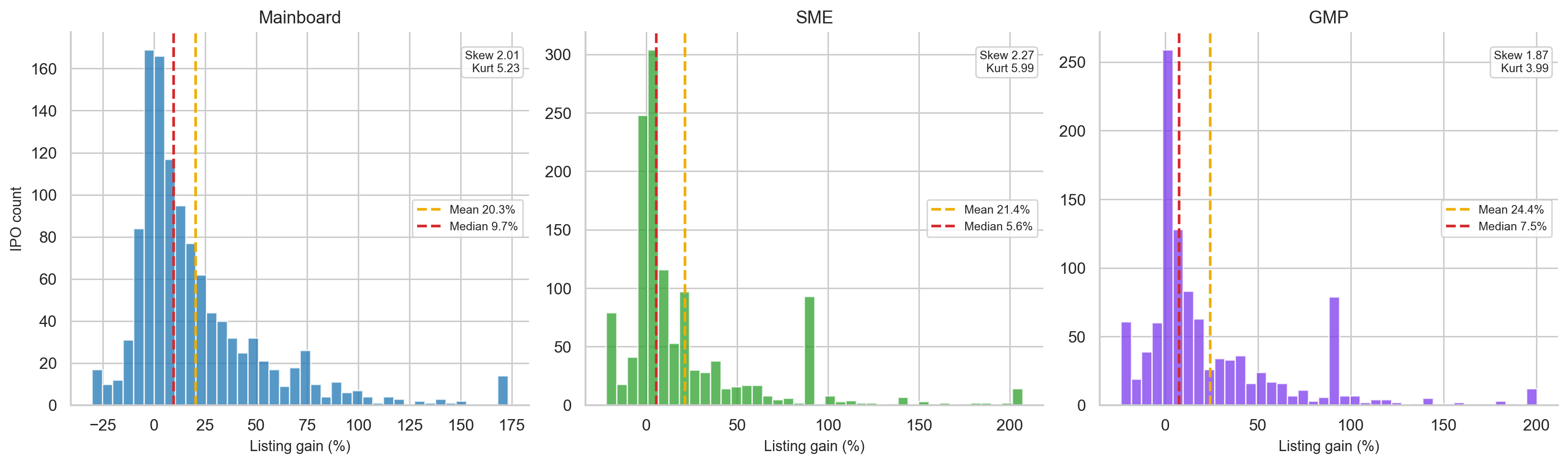
This is one of the most important lessons in the entire project:
In IPO investing, the mean tells you what the dataset earned. The median tells you what the typical investor experienced.
Mainboard listing gains also contain extreme outliers. The maximum observed listing gain in the long-history dataset is 4,940%. That kind of observation can heavily distort the mean, standard deviation, and any model that does not treat outliers carefully.
For this reason, several charts and model targets use winsorised returns, where extreme values are capped at selected percentiles to prevent one or two observations from dominating the entire analysis.
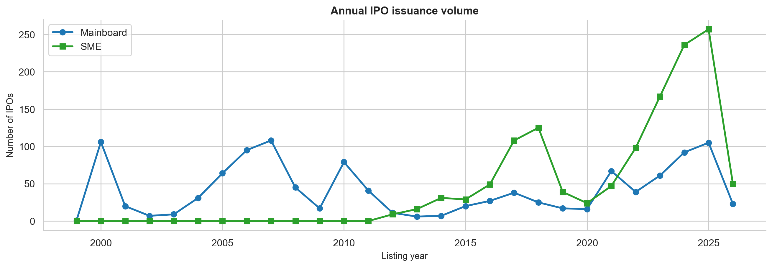
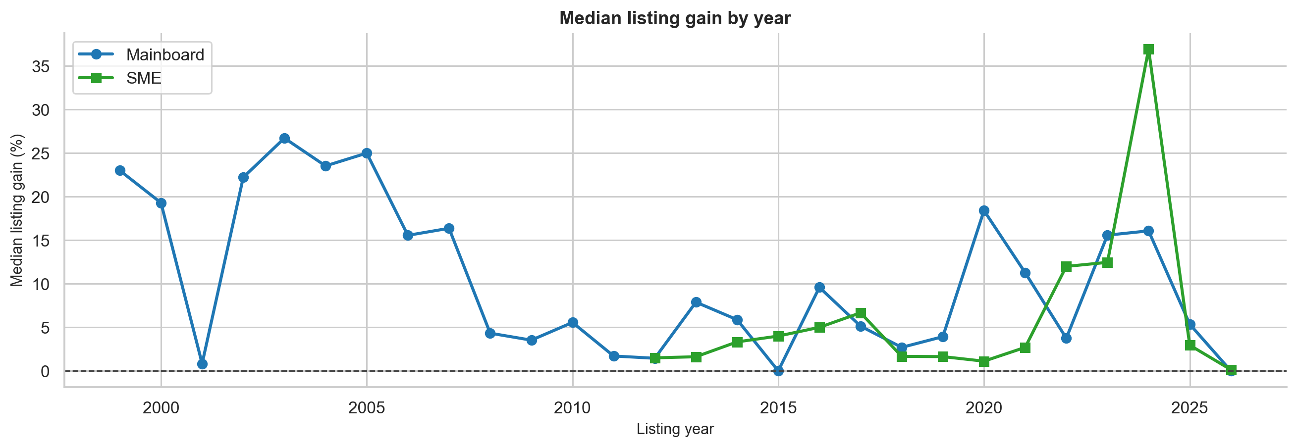
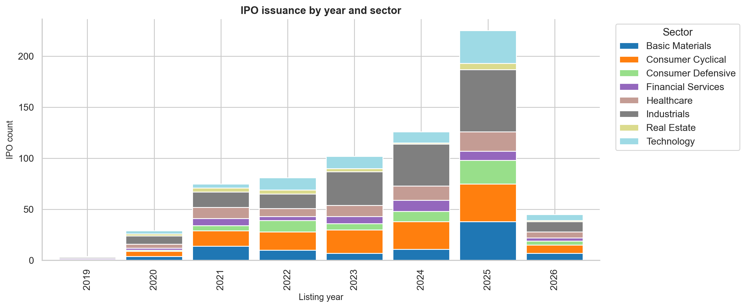
IPO Activity Is Cyclical
IPO markets are not steady. They move in waves.
The notebook shows that IPO issuance is strongly linked to market sentiment and liquidity conditions. During hot markets, more companies list, investors are more willing to pay for growth, and GMP tends to rise. During weak markets, the pipeline slows and listing gains compress.
The GMP-era dataset makes this visible:
- 2023 and 2024 were very strong IPO years.
- 2024 had a particularly high median listing gain of 30.36%.
- 2025 had very high IPO supply, but gains compressed.
- 2026, in the partial sample, showed a much weaker environment.
This is an important distinction: more IPOs does not always mean better IPO returns. When too many companies rush to list, investor attention and liquidity can get diluted.
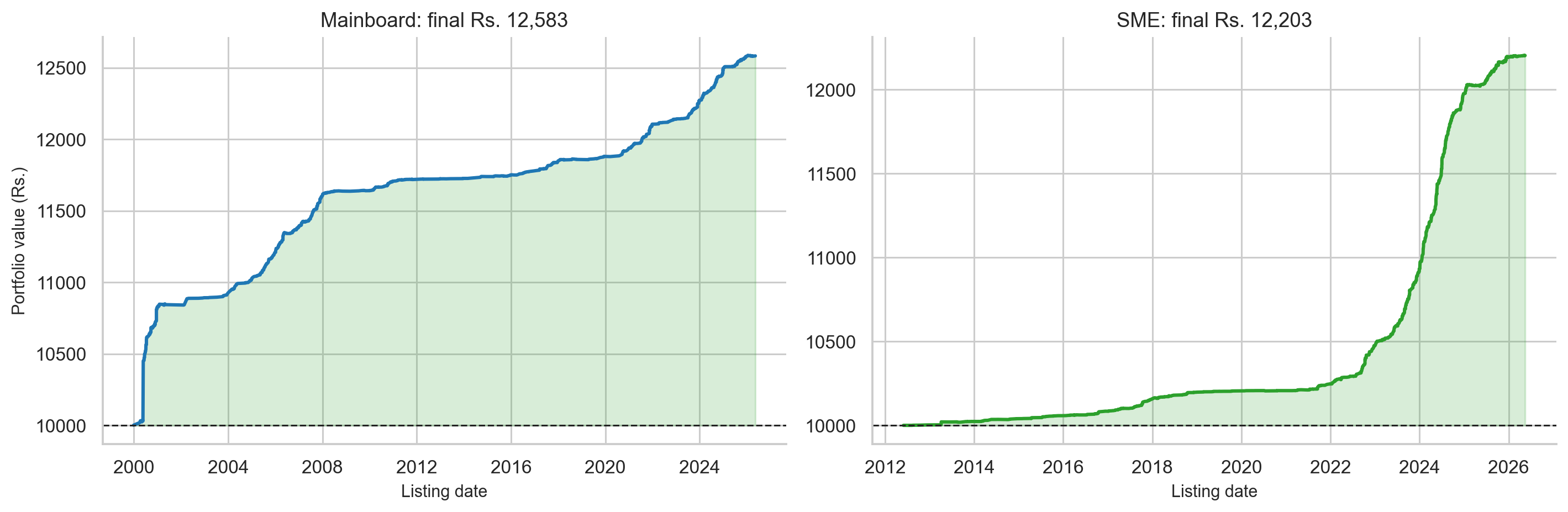
Strategy 1: Apply to Every IPO
The first strategy is the naive baseline:
Apply to every IPO and sell at listing.
This is important because every more advanced strategy must beat this baseline to be useful.
For the all-IPO baseline, the analysis found:
| Segment | N | Mean gain | Median gain | Win rate | Loss rate | Flat rate |
|---|---|---|---|---|---|---|
| Mainboard | 1,177 | 25.83% | 9.68% | 72.8% | 21.9% | 5.3% |
| SME | 82 | 31.72% | 1.78% | 62.2% | 20.7% | 17.1% |
| Combined | 1,259 | 26.21% | 9.09% | 72.1% | 21.8% | 6.0% |
On paper, this works. The expected return is positive and statistically significant.
In practice, it is less comfortable:
- About 1 in 5 mainboard IPOs produces a negative listing return.
- The standard deviation is very high.
- Allotment is not guaranteed, especially in heavily oversubscribed IPOs.
- Capital is blocked during the application period.
- Taxes and transaction costs are not included.
- The most attractive IPOs are often the ones where allotment probability is lowest.
So the all-IPO strategy is a positive expected-value strategy historically, but it is noisy. A retail investor can still have long stretches of poor realised outcomes because getting allotted is random and losses are frequent.
The right interpretation is not “apply blindly to everything.” It is:
IPOs have a positive base rate, but selection matters.
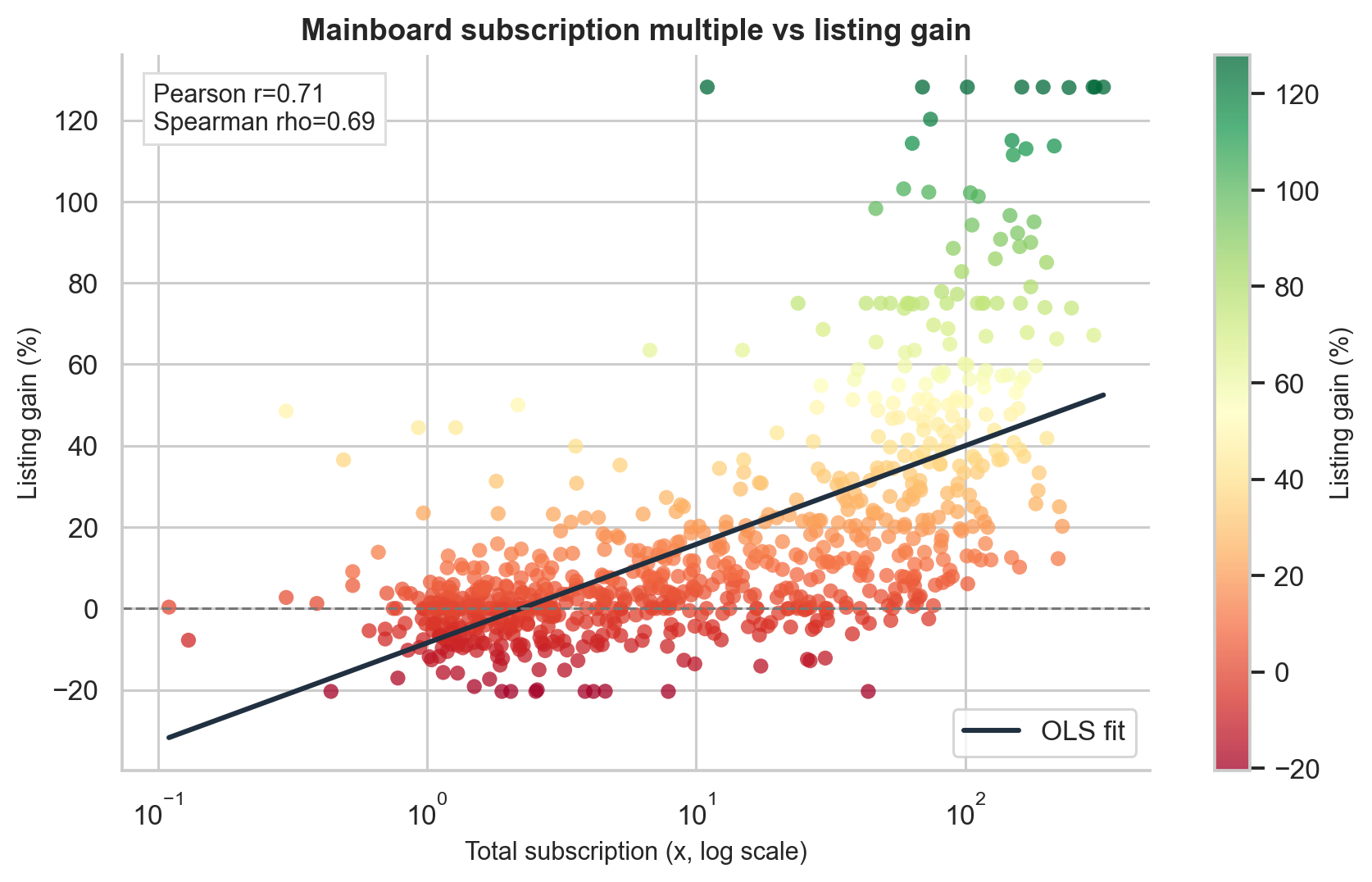
Strategy 2: Filter by Oversubscription
The next strategy asks whether demand contains information.
Oversubscription tells us how many times the offered shares were demanded by investors. If an IPO is subscribed 50x, investors applied for 50 times the number of shares available.
This matters because IPO listing price is shaped by supply and demand. If demand far exceeds supply during subscription, many investors who failed to receive shares may still want to buy after listing. That creates upward pressure on listing day.
The mainboard subscription-filter results are:
| Filter | N | Mean gain | Median gain | Win rate | Std dev | Sharpe-like |
|---|---|---|---|---|---|---|
| All with subscription data | 788 | 16.76% | 5.97% | 69.3% | 29.96% | 0.559 |
| Subscription above median | 393 | 31.99% | 21.58% | 88.5% | 34.81% | 0.919 |
| Subscription above 75th percentile | 197 | 48.06% | 40.78% | 99.0% | 38.15% | 1.260 |
| QIB above 75th percentile | 197 | 46.94% | 37.42% | 98.5% | 38.22% | 1.228 |
| Subscription above 50x | 206 | 47.04% | 38.92% | 98.5% | 37.90% | 1.241 |
| Subscription above 100x | 81 | 63.90% | 56.67% | 100.0% | 44.48% | 1.436 |
A one-sided Mann-Whitney U test confirms that each filtered group performs significantly better than the baseline, with p < 0.0001.
The most striking result is the Sub > 100x bucket:
Every observed mainboard IPO with total subscription above 100x produced a positive listing return in the sample.
That does not mean future 100x IPOs are risk-free. It means that in this historical dataset, extremely high subscription was an unusually clean signal of listing-day demand.
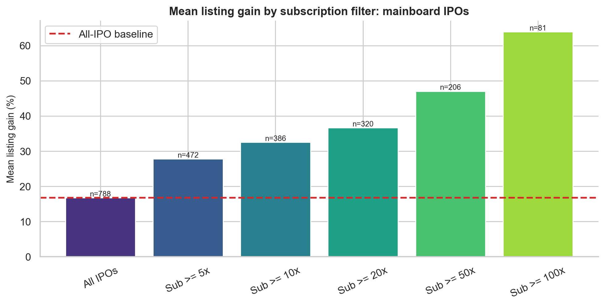
There is also an economic explanation. In a heavily oversubscribed IPO, the issue price is below the market-clearing price implied by demand. Listing day becomes the first chance for unsuccessful applicants to buy in the open market. That demand gap creates the pop.
But oversubscription has a caveat: not all demand is equal.
QIB demand, coming from qualified institutional buyers, may reflect due diligence and valuation work. NII or HNI demand can be amplified by leverage. Retail demand is often more sentiment-driven. This is why the project separately examines subscription composition.
Oversubscription Deep Dive
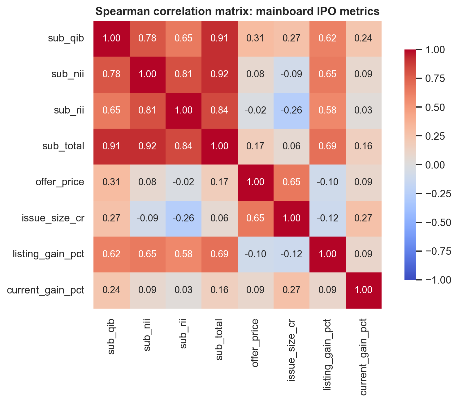
The Spearman rank correlations between subscription categories and listing gain are:
| Feature | Spearman rho | Interpretation |
|---|---|---|
| Total subscription | 0.685 | Strongest overall demand signal |
| NII / HNI subscription | 0.648 | Strong, often levered demand |
| QIB subscription | 0.616 | Institutional conviction signal |
| Retail subscription | 0.583 | Useful, but weakest of the four |
All four are statistically significant with p < 0.0001.
Spearman correlation is used here because IPO returns are not normally distributed. We care less about whether the relationship is perfectly linear and more about whether higher subscription generally ranks with higher listing gain. Spearman correlation captures that monotone relationship.
The decile analysis makes the pattern easier to see. When IPOs are sorted into ten groups by total subscription, the median listing gain rises almost monotonically:
| Total subscription decile | Median listing gain |
|---|---|
| D1 | 0.00% |
| D2 | 0.00% |
| D3 | 0.00% |
| D4 | 0.46% |
| D5 | 4.09% |
| D6 | 8.62% |
| D7 | 12.32% |
| D8 | 23.41% |
| D9 | 35.50% |
| D10 | 56.76% |
This is one of the cleanest empirical patterns in the project.
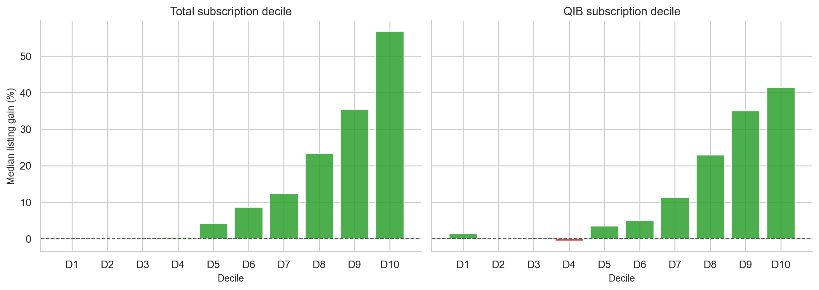
The practical lesson is simple: subscription is not just noise. It is a demand signal with strong rank-ordering power.
Strategy 3: Should You Hold After Listing?
This is one of the most useful questions for a retail investor who gets allotted shares:
Should I sell on listing day, or hold for long-term returns?
The GMP dataset contains post-listing returns at multiple horizons. The results are:
| Period | N | Mean return | Median return | Win rate | Std dev | Sharpe-like |
|---|---|---|---|---|---|---|
| Listing Day | 1,075 | 24.97% | 7.55% | 72.1% | 45.11% | 0.554 |
| 1 Week | 702 | -0.72% | 0.00% | 32.5% | 11.58% | -0.062 |
| 1 Month | 698 | 0.03% | 0.00% | 37.1% | 28.88% | 0.001 |
| 3 Months | 675 | 1.58% | 0.00% | 38.8% | 39.52% | 0.040 |
| 6 Months | 618 | 5.19% | 0.00% | 37.1% | 53.90% | 0.096 |
| 1 Year | 462 | 21.73% | 0.00% | 41.8% | 94.72% | 0.229 |
| 2 Years | 338 | 47.91% | 0.00% | 43.5% | 174.70% | 0.274 |
| 3 Years | 208 | 124.23% | 3.65% | 50.5% | 350.40% | 0.355 |
The table looks strange at first. The mean becomes very large at 2 and 3 years, but the median remains near zero for most horizons. This means a small number of long-term multi-baggers drive the average, while the typical IPO stock does not produce strong post-listing returns.
A paired t-test comparing 1-year return against listing-day gain for the same IPOs gives:
- N = 462
- t = -0.884
- p = 0.377
- Mean 1-year return = 21.73%
- Mean listing gain = 26.00%
- Difference = -4.27 percentage points
The result is not statistically significant. In other words, the data does not support the claim that holding for 1 year beats selling at listing.
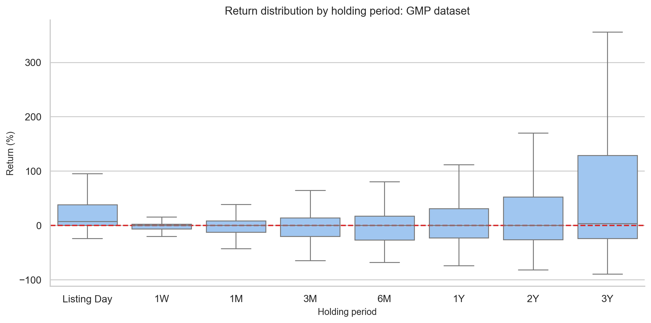
The interpretation:
Listing-day flipping captures the IPO-specific demand imbalance. After listing, the stock becomes a normal equity, exposed to fundamentals, sector rotation, liquidity, and broader market moves.
Holding can work for exceptional companies. But as a default rule, holding every allotted IPO is not supported by the data.
Strategy 4: Grey Market Premium as a Predictor
GMP is the strongest single predictor in the study.
The correlation between GMP percentage and listing gain is:
$$ \text{Pearson } r = 0.835 \quad (p < 0.0001) $$
$$ \text{Spearman } \rho = 0.743 \quad (p < 0.0001) $$
$$ R^2 = 0.697 $$
That means GMP alone explains about 69.7% of listing gain variance in a simple linear model. For financial data, this is unusually strong.
Even more interesting, the OLS slope is approximately 0.999 with an intercept near -0.096. In plain English:
On average, a GMP of X% predicts a listing gain close to X%.
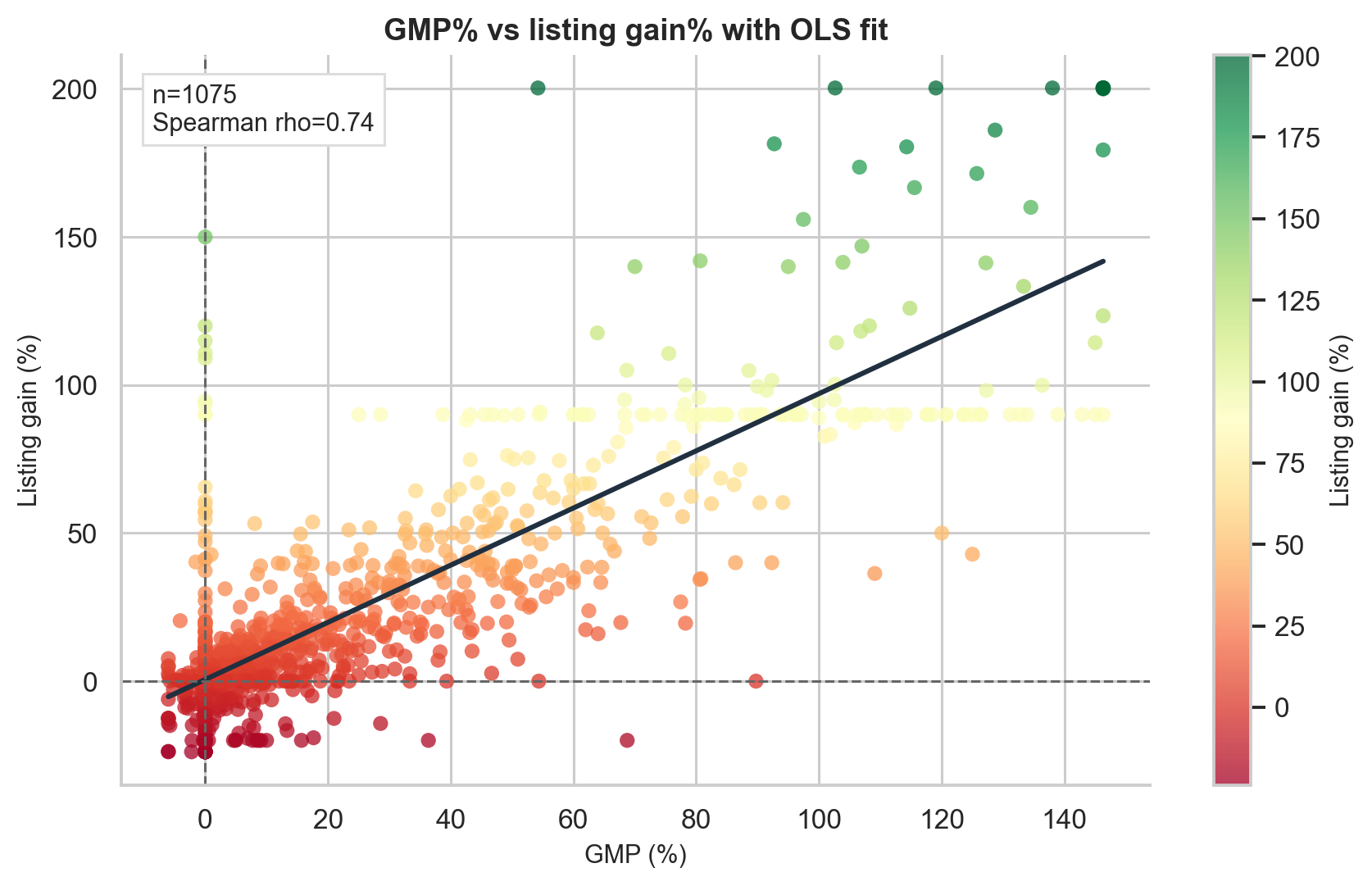
GMP also predicts direction well. A simple rule such as “positive GMP predicts positive listing gain” gets the sign right in 72.3% of cases.
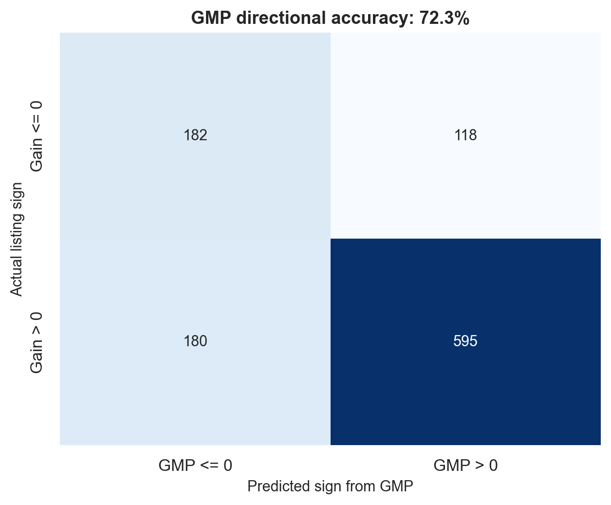
But GMP is not perfect. Its mean absolute error as a point predictor is 14.47 percentage points. So a GMP of 30% should not be interpreted as “the stock will definitely list at 30%.” A more realistic interpretation is “the market expects a strong listing, but the actual gain could easily be around 15-45%.”
GMP Buckets: A More Practical View
Instead of treating GMP as an exact forecast, it is often better to bucket it.
| GMP zone | N | Mean gain | Median gain | Win rate | Pop >= 10% |
|---|---|---|---|---|---|
| Very negative (< -5%) | 15 | -7.52% | -6.11% | 33.3% | 0.0% |
| Negative (-5% to 0%) | 347 | 2.83% | 0.08% | 50.4% | 14.4% |
| Flat (0-10%) | 223 | 3.07% | 2.75% | 61.4% | 16.1% |
| Moderate (10-20%) | 115 | 13.45% | 12.65% | 82.6% | 63.5% |
| High (20-40%) | 119 | 25.53% | 23.10% | 92.4% | 79.8% |
| Very high (> 40%) | 256 | 80.90% | 81.68% | 98.8% | 98.1% |
The lesson is intuitive:
- Negative GMP is dangerous.
- Flat GMP is uncertain.
- Moderate GMP is meaningfully better than random.
- High GMP has very strong win rates.
- Very high GMP historically almost always led to a positive listing.
However, GMP comes from an informal and unregulated market. It can be thin, sentiment-driven, and sometimes manipulated. It should be treated as a sentiment gauge, not as a law of physics.
Combining GMP and Subscription
GMP and subscription measure related but different things.
- GMP measures market expectation before listing.
- Subscription measures actual demand during the IPO window.
The joint filter in the report tests:
| |
The results:
| Filter | N | Mean gain | Win rate | Sharpe-like |
|---|---|---|---|---|
| All IPOs | 1,075 | 24.97% | 72.1% | 0.554 |
| GMP > 10% only | 490 | 51.62% | 93.5% | 0.990 |
| Subscription > median only | 537 | 47.41% | 87.9% | 0.897 |
| GMP > 10% and subscription > median | 442 | 54.89% | 94.6% | 1.029 |
This is the most practical rule-of-thumb result in the project:
GMP and subscription are strongest when they agree.
If the grey market is strong and actual subscription demand is also strong, the IPO has both sentiment support and revealed demand support.
Market Phase: Bull, Bear, or Sideways
The project defines market phase using trailing Nifty 50 returns:
- Bull: Nifty 3-month return above +5%
- Bear: Nifty 3-month return below -5%
- Sideways: everything in between
Because IPO returns are skewed and have unequal variances across groups, I used a Kruskal-Wallis H-test rather than one-way ANOVA.
The results:
| Market phase | N | Mean gain | Median gain | Win rate |
|---|---|---|---|---|
| Bull | 445 | 33.88% | 14.41% | 80.2% |
| Sideways | 521 | 19.91% | 5.15% | 67.0% |
| Bear | 109 | 12.80% | 2.74% | 63.3% |
Kruskal-Wallis:
- H = 41.001
- p < 0.0001
- Effect size eta-squared approx 0.037
The effect is statistically significant but modest. Market phase matters, but it is not as strong as GMP or subscription.
Pairwise Mann-Whitney tests with Bonferroni correction show:
- Bull vs sideways: significant
- Bull vs bear: significant
- Sideways vs bear: not significant (p = 0.1226)
The non-significant sideways vs bear result is actually interesting. Companies self-select into IPO windows. In weak markets, only stronger or more attractively priced IPOs may proceed, partly offsetting the negative market environment.
SME vs Mainboard IPOs
SME IPOs are often marketed as high-growth opportunities, and some produce spectacular returns. But the data shows a more complicated picture.
| Segment | N | Mean gain | Median gain | Std dev | Win rate | Loss rate |
|---|---|---|---|---|---|---|
| Mainboard | 1,177 | 25.83% | 9.68% | 150.84% | 72.8% | 21.9% |
| SME analysis sample | 82 | 31.72% | 1.78% | 65.47% | 62.2% | 20.7% |
At first glance, SME IPOs have a higher mean. But the median is much lower. The typical SME listing gain is only 1.78%, compared with 9.68% for mainboard IPOs.
A Mann-Whitney U test gives p = 0.4432, meaning the distributions are not statistically significantly different.
Three practical differences stand out:
- SME returns have a much lower median.
- 17.1% of SME listing returns are exactly zero, reflecting liquidity issues.
- SME performance depends heavily on a small number of exceptional winners.
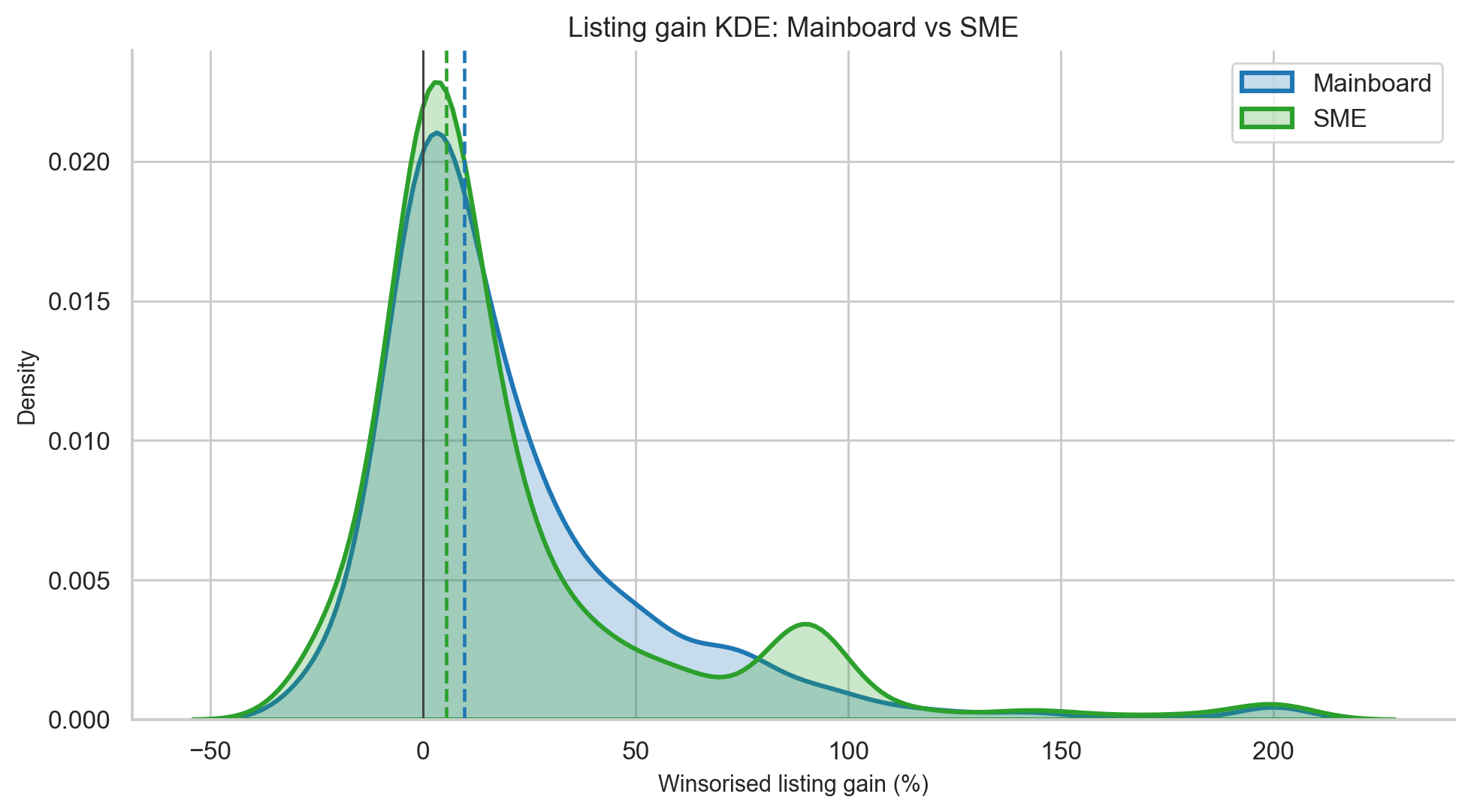
The practical interpretation:
SME IPOs can produce large winners, but the typical SME investor does not experience the headline mean. Liquidity risk and flat listings matter.
Loss-Making Companies: Short-Term Pop, Long-Term Weakness
Several modern IPOs, especially new-economy companies, listed while still loss-making. The question is whether loss-making companies behave differently from profitable ones.
Using trailing PAT from the GMP enriched dataset:
| Metric | Profitable companies | Loss-making companies |
|---|---|---|
| Listing day mean | 18.99% | 29.01% |
| 1-month mean | 0.39% | -5.30% |
| 3-month mean | 2.29% | -8.41% |
| 6-month mean | 6.44% | -10.55% |
| 1-year mean | 25.05% | -11.54% |
The listing-day result is counterintuitive. Loss-making companies have higher mean listing gains. But the Mann-Whitney test for listing-day performance gives p = 0.9426, so the difference is not statistically significant.
Why might loss-making companies pop at listing?
One explanation is underpricing. When valuation is uncertain, bankers may price the IPO conservatively to ensure demand. That can create a listing-day gain even if the company is not fundamentally strong.
But the long-term picture reverses sharply. By 1 year, profitable companies are up 25.05% on average from listing price, while loss-making companies are down 11.54%. That is a 36.6 percentage-point gap.
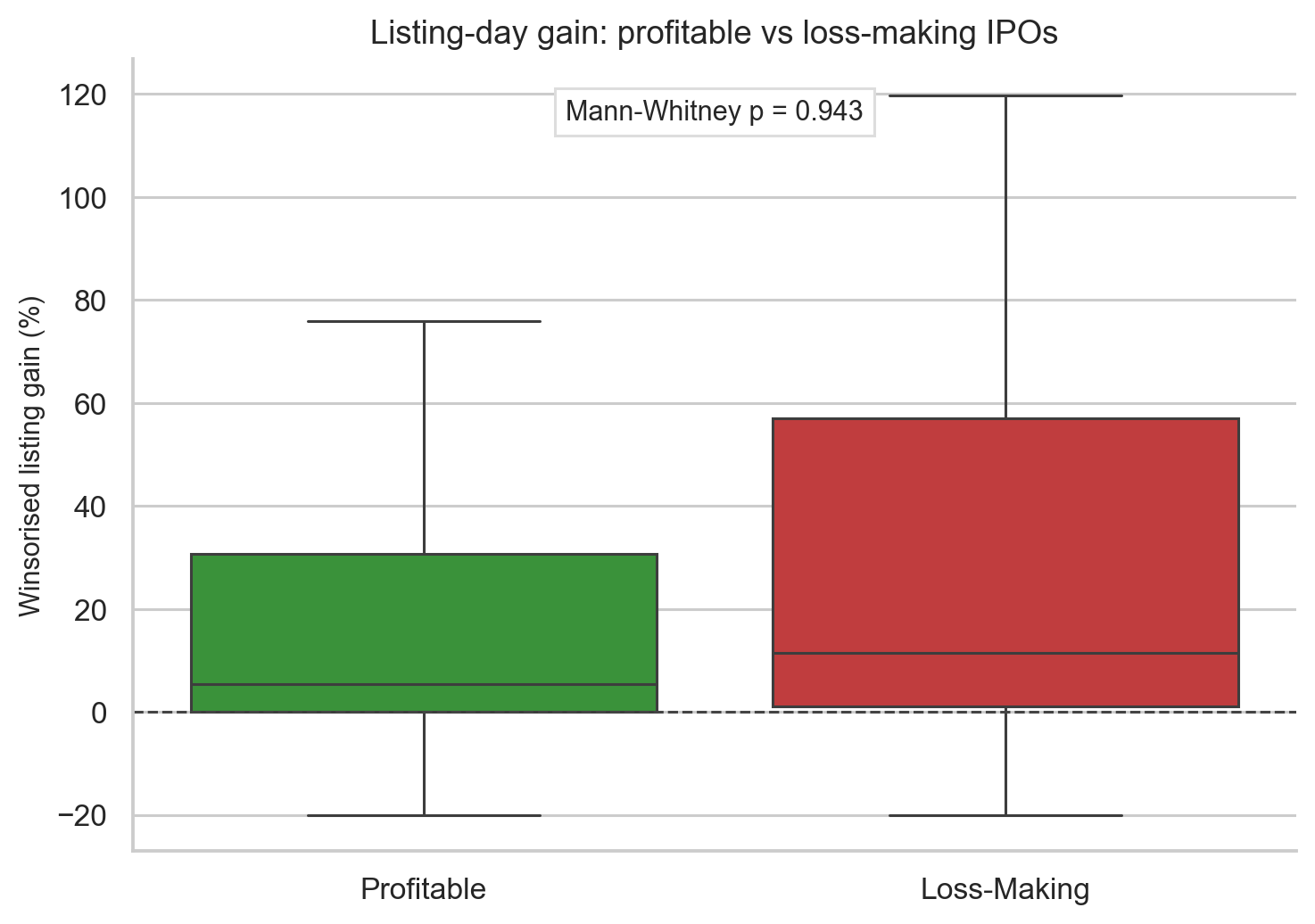
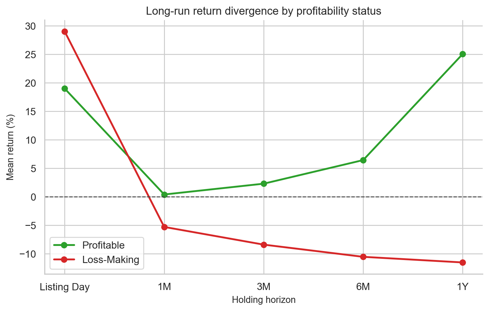
This is one of the cleanest finance lessons in the project:
Sentiment can create a listing pop, but cash-flow quality matters over time.
IPO Cycle and Momentum
The notebook also tests whether recent IPO market performance predicts the next IPO.
The rolling 90-day average listing gain of previous IPOs has:
$$ \text{Spearman } \rho = 0.312, \quad p < 0.0001 $$
This means IPO momentum exists. If recent IPOs have listed strongly, the next IPO is more likely to list strongly too.
This is not surprising. IPOs cluster in sentiment regimes. A few strong listings attract more retail applications, push GMP higher, and encourage more companies to launch offers.
But this also creates a danger: momentum can turn into overcrowding. When too many companies list in a short window, investor attention and liquidity get stretched.
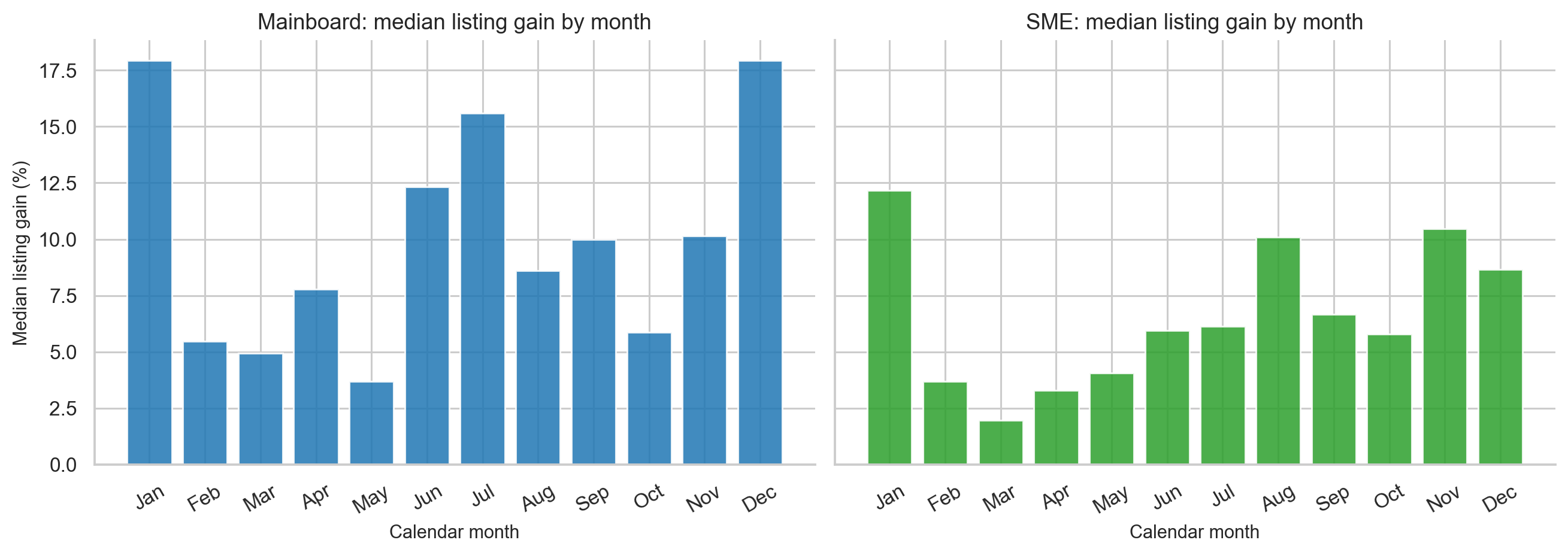
The seasonality analysis did not find a reliable “best month” effect. Calendar timing is much weaker than demand, GMP, and market phase.
Machine Learning: Predicting the Day-One Pop
The project then turns the IPO problem into a binary classification task:
$$ y_i = \mathbf{1}{\text{listing gain}_i \geq 10%} $$
In words: predict whether an IPO will produce a listing gain of at least 10%.
Only pre-listing features are allowed. This is important. A model that uses listing price, post-listing returns, or current return would be cheating.
Feature groups included:
| Feature group | Examples |
|---|---|
| Demand | log subscription, total subscription |
| GMP | GMP as percentage of offer price |
| Interactions | GMP x subscription, issue size x demand |
| Market regime | Nifty 1M/3M returns, bull/bear/sideways phase |
| IPO cycle | rolling 30D/90D listing gains, recent IPO count |
| Fundamentals | P/E, P/B, profit margin, revenue growth |
The validation split was chronological:
- Train: older 80% of GMP-era IPOs, 2019 to early 2025
- Test: most recent 20%, approximately September 2025 to May 2026
This is stricter than a random split. A random split would mix future and past market regimes, making the model look better than it really is. A chronological split asks the realistic question: can the model trained on history rank future IPOs?
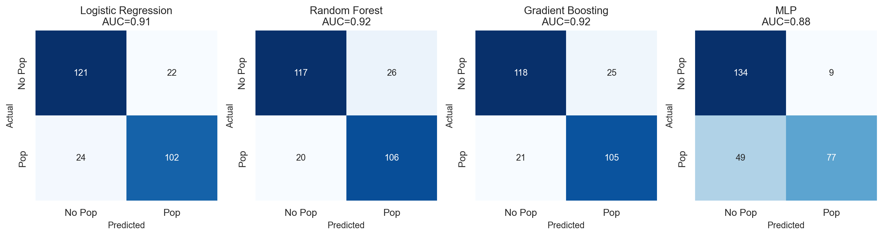
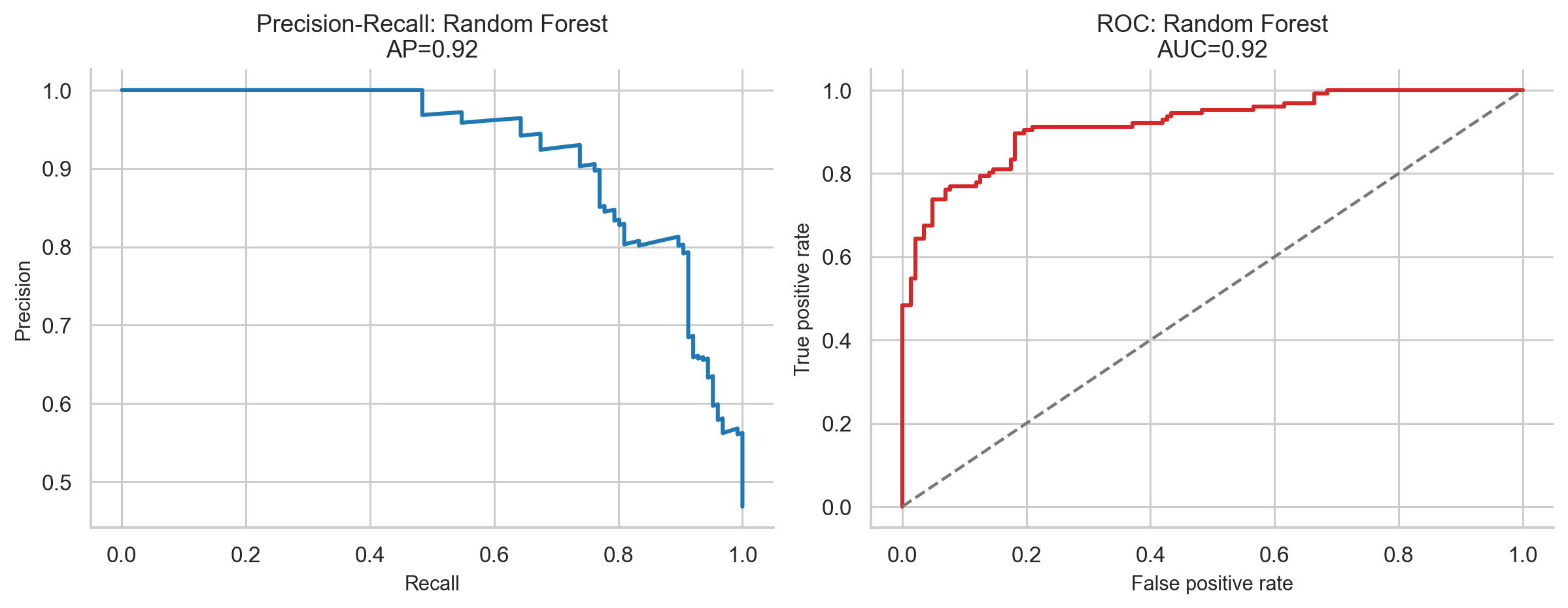
Classifier Results
| Model | Accuracy | F1-score | ROC-AUC | Overfit? |
|---|---|---|---|---|
| Logistic Regression | 80.47% | 0.611 | 0.855 | No |
| Random Forest | 86.05% | 0.727 | 0.863 | No |
| Gradient Boosting | 85.58% | 0.693 | 0.850 | No |
| MLP Neural Network | 81.40% | 0.636 | 0.858 | No |
The best model is Random Forest:
- Accuracy = 86.05%
- F1-score = 0.727
- ROC-AUC = 0.863
For financial prediction, an out-of-sample AUC of 0.863 is strong. A random classifier would have AUC 0.5, while a perfect classifier would have AUC 1.0.
The test period had only about 29.3% positive cases, reflecting a weaker late-2025 to 2026 IPO market. Because of that class imbalance, F1-score is more informative than raw accuracy.
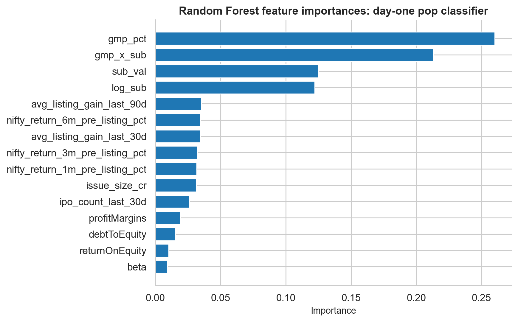
What the Classifier Learned
The logistic regression coefficients are useful because they are interpretable:
| Feature | Coefficient | Interpretation |
|---|---|---|
| GMP percentage | +1.379 | Higher GMP strongly increases pop probability |
| GMP x subscription | +0.952 | GMP and demand reinforce each other |
| Log subscription | +0.874 | More demand increases pop probability |
| Size x subscription | +0.739 | Demand relative to issue size matters |
| Log IPO size | -0.349 | Larger IPOs pop less |
| Bull phase | +0.280 | Bull markets help |
This lines up with the earlier statistical analysis. The model did not discover a mysterious black-box pattern. It learned the same economics:
- Strong grey market expectation helps.
- Strong subscription demand helps.
- The two signals are strongest together.
- Larger issues face more supply.
- Bull markets improve the base rate.
Leakage Audit
Yahoo Finance fundamentals may contain look-ahead bias because they are not guaranteed to represent values exactly at IPO date.
To test this, the Random Forest model was retrained without fundamentals such as trailing P/E, P/B, profit margin, and revenue growth.
The AUC changed from:
- Full model AUC = 0.8629
- No-fundamentals AUC = 0.8499
- Delta = 0.0130
The drop is less than 0.02. This means the model’s performance is not mainly coming from potentially leaky Yahoo Finance fundamentals. It is driven by GMP, subscription, and market-regime signals.
That is reassuring, because those features are observable before listing.
Predicting the Magnitude of Listing Gain
The next task is harder:
Instead of predicting whether an IPO pops by at least 10%, can we predict the actual listing gain percentage?
This is a regression problem. The target was winsorised to reduce the impact of extreme outliers.
| Model | MAE | RMSE | R-squared |
|---|---|---|---|
| Ridge Regression | 10.29% | 14.69% | 0.570 |
| Random Forest Regressor | 10.41% | 15.84% | 0.500 |
| Gradient Boosting Regressor | 11.27% | 16.25% | 0.474 |
Ridge Regression performs best. That is not surprising because the GMP-listing gain relationship is close to linear.
An R-squared of 0.570 means pre-listing features explain about 57% of the variation in listing gains. The remaining 43% is genuine noise:
- Order matching on listing day
- Last-minute news
- Overall market movement
- Institutional and retail flow
- Randomness of demand around open and close
The MAE of 10.29 percentage points means that if the model predicts a 30% listing gain, it should be interpreted as approximately “strong expected listing”, not as a precise 30.00% forecast.
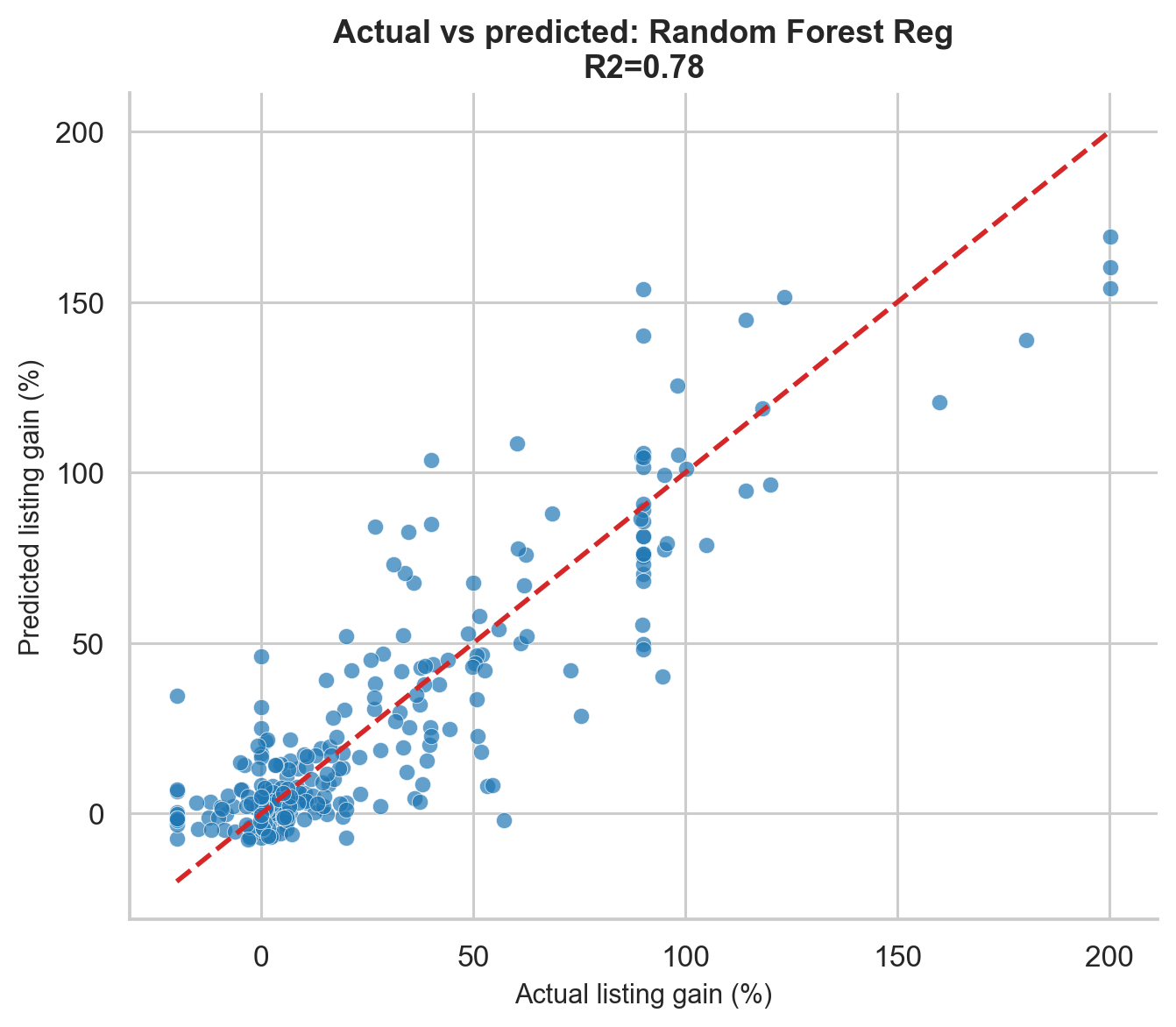
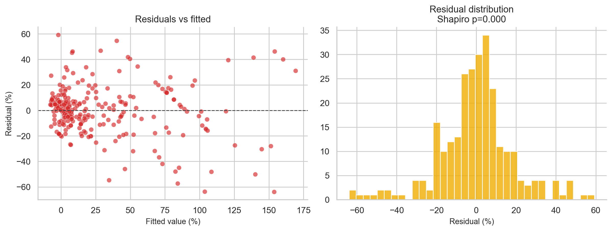
The Shapiro-Wilk test on residuals gives p < 0.0001, confirming non-normal residuals. So Gaussian prediction intervals would be unreliable. The regression model is best used for ranking IPOs, not for exact point forecasts.
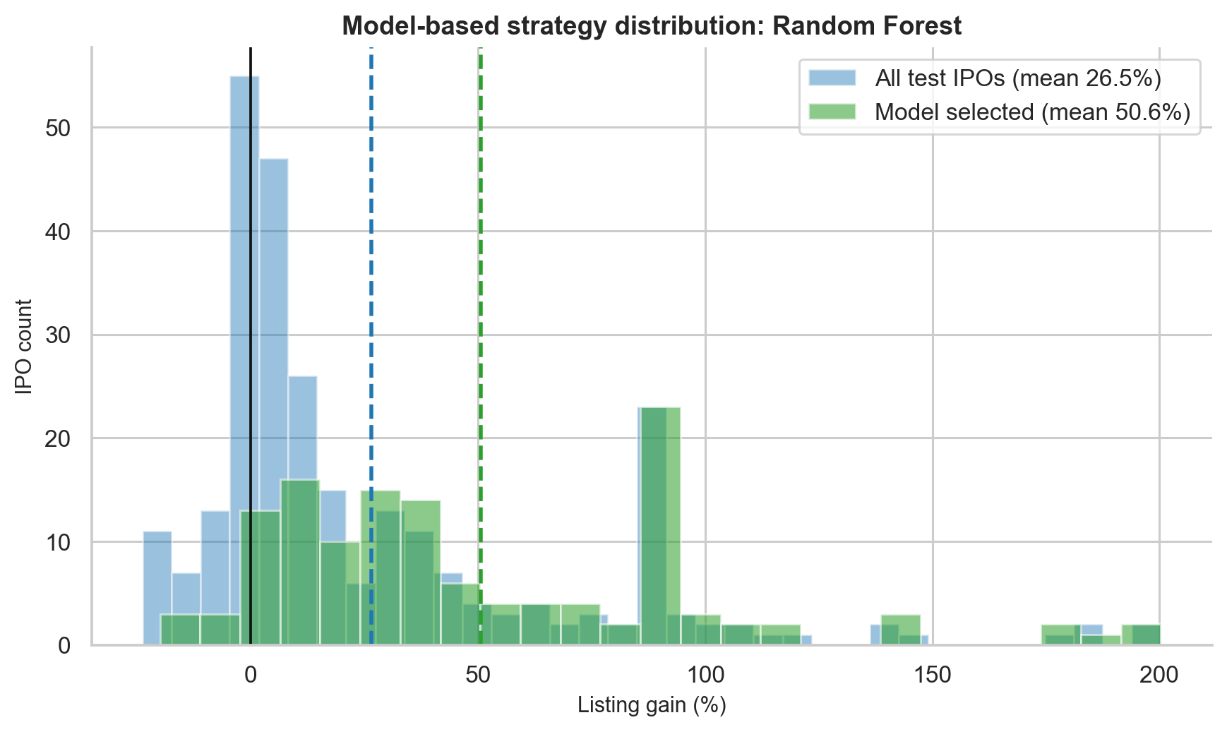
Model-Based Backtest
The final test is the most practical one:
If an investor used the trained classifier in the unseen test period, would it improve IPO selection?
The backtest used the Random Forest classifier on the out-of-sample period from approximately September 2025 to May 2026. The rule was:
| |
The result:
| Group | N | Mean gain | Win rate |
|---|---|---|---|
| All test-period IPOs | 215 | 6.06% | 55.3% |
| Model-selected IPOs | 35 | 31.21% | 94.3% |
Mann-Whitney U = 6,020, p < 0.0001.
The model filtered 215 recent IPOs down to 35 high-confidence picks. Mean gain improved by 25.2 percentage points, and win rate improved by 39 percentage points.
This is a strong result, but it needs caveats:
- The test period is one 8-month window, not a full rolling walk-forward validation.
- The 60% threshold was selected after inspecting test behaviour, so it may be optimistic.
- Allotment probability is not modelled.
- Brokerage, taxes, and capital blocking are excluded.
- A future bear market could weaken the relationship.
So the correct conclusion is not “the model is a money machine.” The correct conclusion is:
A model trained on pre-listing signals can meaningfully rank IPOs by expected listing success, but the strategy needs stricter walk-forward validation before real deployment.
Sector Patterns
Sector labels are available for around two-thirds of the GMP-era dataset. The sector analysis shows large differences in mean listing gains:
| Sector | Count | Mean listing gain |
|---|---|---|
| Energy | 7 | 46.31% |
| Communication Services | 14 | 36.83% |
| Technology | 81 | 26.58% |
| Healthcare | 73 | 24.65% |
| Industrials | 183 | 24.52% |
| Financial Services | 44 | 17.70% |
| Consumer Cyclical | 134 | 15.74% |
| Basic Materials | 91 | 14.13% |
| Consumer Defensive | 60 | 9.48% |
| Real Estate | 21 | 2.58% |
| Utilities | 7 | -0.33% |
The broad pattern is plausible:
- Technology, energy, and communication services saw stronger listing gains.
- Financial services and infrastructure-type IPOs often had larger issue sizes and more modest premiums.
- Utilities and real estate were weaker in the GMP-era sample.
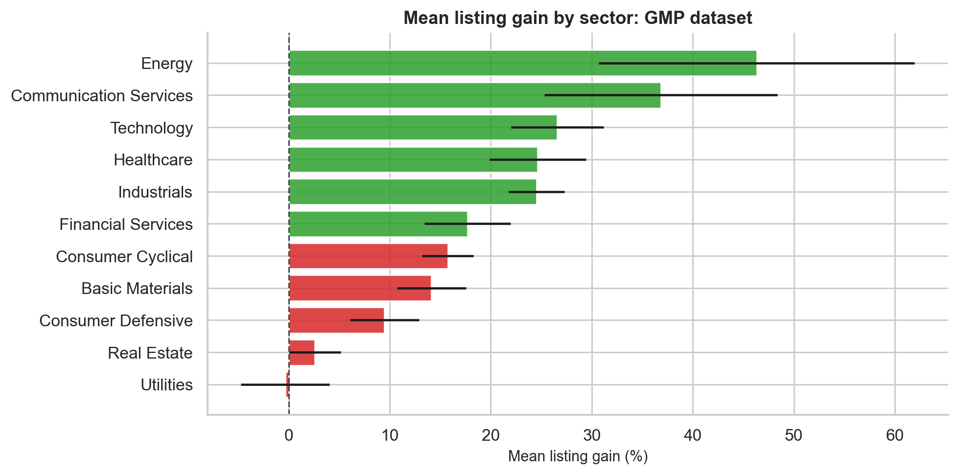
Sector results should be interpreted cautiously because some sectors have very small sample sizes. Energy has only 7 observations, so its high mean is not as reliable as a sector with 100+ observations.
What the Results Teach Us
The project produces several practical lessons.
First, IPO investing has a positive historical base rate. Mainboard IPOs produced a mean listing gain of 25.83% and a median of 9.68%, with a 72.8% win rate.
Second, the average overstates the typical experience. The distribution is right-skewed, and a few spectacular IPOs pull the mean upward.
Third, oversubscription is a powerful demand signal. IPOs with total subscription above 100x had a 100% historical win rate in the mainboard sample.
Fourth, GMP is the strongest single predictor. It has Pearson r = 0.835, Spearman rho = 0.743, and R-squared = 0.697 against listing gain.
Fifth, GMP and subscription work best together. The joint filter GMP > 10% and subscription > median produced a 94.6% win rate.
Sixth, listing-day selling is hard to beat on a risk-adjusted basis. Holding for 1 year did not significantly outperform listing-day selling.
Seventh, SME IPOs are not automatically better. The mean is attractive, but the median is low and flat listings are common.
Eighth, loss-making IPOs may list well, but profitable companies dominate over longer horizons.
Ninth, machine learning can improve screening when it uses honest pre-listing features and chronological validation.
Limitations
No empirical project is complete without limitations. The major ones are:
| Limitation | Why it matters |
|---|---|
| Allotment probability excluded | A highly profitable IPO may have very low allotment probability |
| Taxes and brokerage excluded | Realised investor returns are lower |
| GMP is informal | It can be manipulated or thinly traded |
| Current fundamentals may be leaky | Yahoo Finance data is not always IPO-date data |
| SME sample limitations | Comparable analysis-ready SME rows are fewer than raw collected rows |
| One holdout backtest | A rolling walk-forward backtest would be stronger |
| No DRHP NLP yet | Risk-factor language may contain useful signal |
| OFS/fresh issue split missing | Could affect long-term incentives and performance |
These limitations do not invalidate the results, but they shape how confidently we should act on them.
Future Work
There are several natural extensions:
- Build a DRHP NLP pipeline to extract risk factor count, tone, litigation mentions, and related-party transaction language.
- Add Offer-for-Sale vs fresh issue ratios to test whether promoter exits predict weaker long-term returns.
- Add BRLM or underwriter reputation as a feature.
- Reconstruct valuation ratios at IPO date instead of relying on current Yahoo Finance fundamentals.
- Model allotment probability and expected realised return, not just conditional listing gain.
- Run a rolling walk-forward backtest across multiple market regimes.
- Build a separate SME-specific model because SME liquidity and subscription dynamics are structurally different.
Conclusion
The Indian IPO market is not random. It is noisy, skewed, and regime-dependent, but it contains strong measurable signals.
The simplest answer to the original question is:
Yes, Indian IPO investing has historically been profitable on average, but the typical investor experience is much more modest than the headline mean suggests.
The deeper answer is more useful:
IPO selection improves dramatically when investors combine GMP, oversubscription, market phase, and recent IPO momentum.
The strongest empirical signals from this project are:
- Mainboard baseline: 25.83% mean listing gain, 9.68% median, 72.8% win rate.
- Subscription above 100x: 63.90% mean gain, 56.67% median, 100% historical win rate.
- GMP: Pearson r = 0.835, Spearman rho = 0.743, R-squared = 0.697.
- GMP above 40%: 80.90% mean gain, 98.8% win rate.
- Listing-day selling dominates longer holding periods on a risk-adjusted basis.
- Random Forest classifier: 86.05% accuracy, 0.727 F1-score, 0.863 ROC-AUC.
- Model-selected out-of-sample IPOs: 31.21% mean gain and 94.3% win rate vs 6.06% and 55.3% baseline.
For me, the biggest learning was not just financial. It was methodological. A good research project is not only about running models. It is about building trustworthy data, asking questions in the right order, checking assumptions, choosing statistical tests that match the data, and being honest about what the results can and cannot prove.
IPO investing looks like a simple application form. Underneath it is a rich system of demand, sentiment, pricing, liquidity, market timing, and behavioural feedback loops. Data helps make that system visible.